![Signals From [Space]](https://substackcdn.com/image/fetch/w_80,h_80,c_fill,f_webp,q_auto:good,fl_progressive:steep,g_auto/https%3A%2F%2Fsubstack-post-media.s3.amazonaws.com%2Fpublic%2Fimages%2F55686857-6b99-45a6-ac0f-09c9f023f2a0_500x500.png)
![Signals From [Space]](https://substackcdn.com/image/fetch/e_trim:10:white/e_trim:10:transparent/h_72,c_limit,f_auto,q_auto:good,fl_progressive:steep/https%3A%2F%2Fsubstack-post-media.s3.amazonaws.com%2Fpublic%2Fimages%2F4d588ac1-7fac-4bd4-829d-fc7b4e8f1326_1512x288.png)

![Signals From [Space]](https://substackcdn.com/image/fetch/w_36,h_36,c_fill,f_webp,q_auto:good,fl_progressive:steep,g_auto/https%3A%2F%2Fsubstack-post-media.s3.amazonaws.com%2Fpublic%2Fimages%2F55686857-6b99-45a6-ac0f-09c9f023f2a0_500x500.png)
KCC in Numbers: What We Know, What We Don't, and What Comes Next
PY23 Preview: Making Sense of KCC Data—Spending, Quality, and Key Outcomes

The Kidney Care Choices (KCC) Model is the closest iteration toward value-based kidney care we’ve seen, but understanding its true impact requires more than raw numbers or anecdotes—it requires a clear, visual benchmark.
So far, we’ve only seen data from its first performance year (PY22), yet much of it remains scattered across reports and internal analyses beyond what’s publicly available. Tracking the program’s progress starts with a clear visual benchmark of where we began. This baseline not only helps us reflect on PY22 but also prepares us for the soon-to-be-released PY23 results. By mapping spending, patient distribution, quality scores, and home dialysis adoption by affiliate, we can spot patterns, ask better questions, and refine what we track moving forward.
As the article thumbnail image suggests, there are still significant gaps in this data. Time lags, transplant access, patient-level spending, and home dialysis are just a few of the areas where people want more clarity. I've heard murmurs that KCC reports will be going out every six months, but that has not been confirmed. It’s a work in progress, and I’m hopeful we’re headed in the right direction.
This article revisits data from the first performance year (PY22) of the Kidney Care Choices model. We highlight key demographic, operational, and financial metrics across 10 affiliated care coordination organizations.
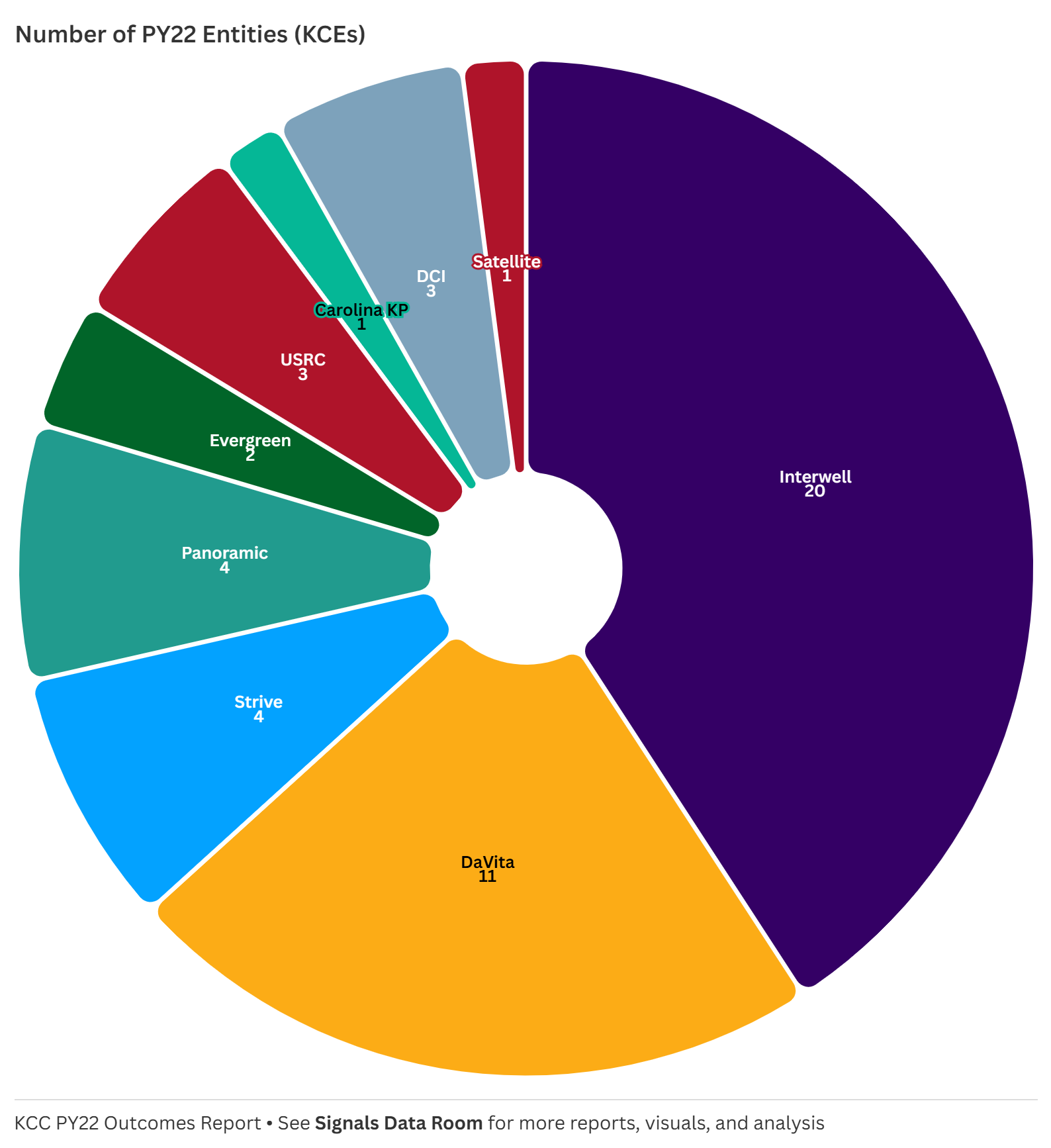
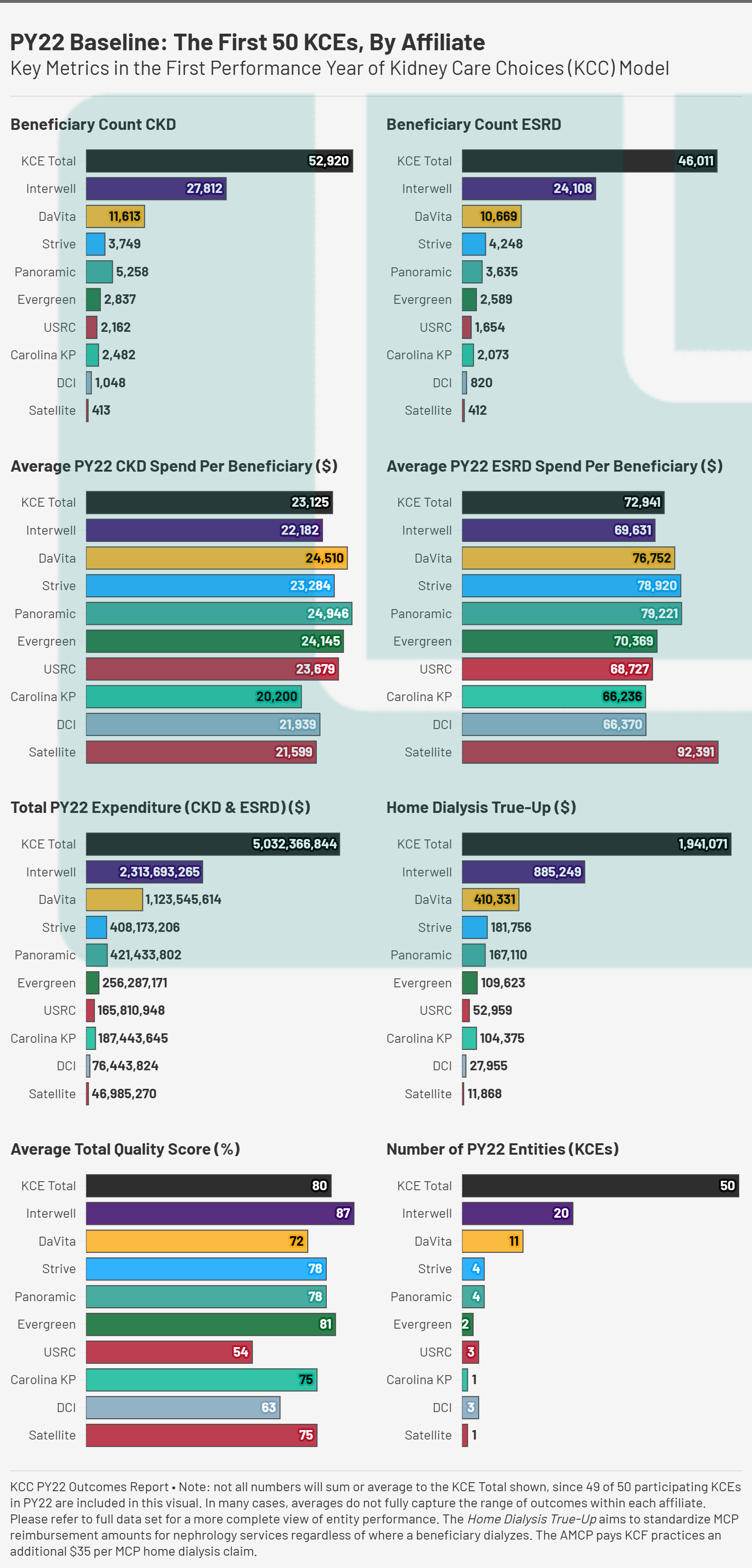
1. Number of Entities: Who’s Participating?
In its first performance year, the total number of KCEs was 50, with Interwell (20) and DaVita (11) representing the largest share. Other groups, such as Strive, Panoramic, and Evergreen, had fewer entities but still managed sizable patient populations. This breakdown highlights the consolidation within kidney care and raises strategic questions: Are larger provider groups better positioned to succeed in value-based care, or do smaller entities have advantages in tailoring their approach? Can smaller entities even participate without the likes of a VBC enabler? The jury may still be out on that one (for now), but recall last year’s update on PY24 participating entities and that may give you a clue as to where things may be headed.
“Last month, CMS shared an update on its KCC Model participants for 2024, which includes 123 participants, over 9,200 providers, and more than 280,000 beneficiaries…”
2. Beneficiary Count: Understanding Scope & Scale
The beneficiary count charts for CKD and ESRD illustrate the scale at which different Kidney Care Entities (KCEs) are operating. Interwell and DaVita had the largest patient populations, with Interwell managing 27,812 CKD and 24,108 ESRD patients, while DaVita followed with over 11,000 CKD and 10,000 ESRD beneficiaries. Other affiliates, such as Strive, Panoramic, and Evergreen, had significantly smaller patient counts in the first year of the KCC model. Understanding these numbers is essential to contextualizing spending trends in the years ahead—do larger populations drive down per-patient costs, or do they introduce inefficiencies?1
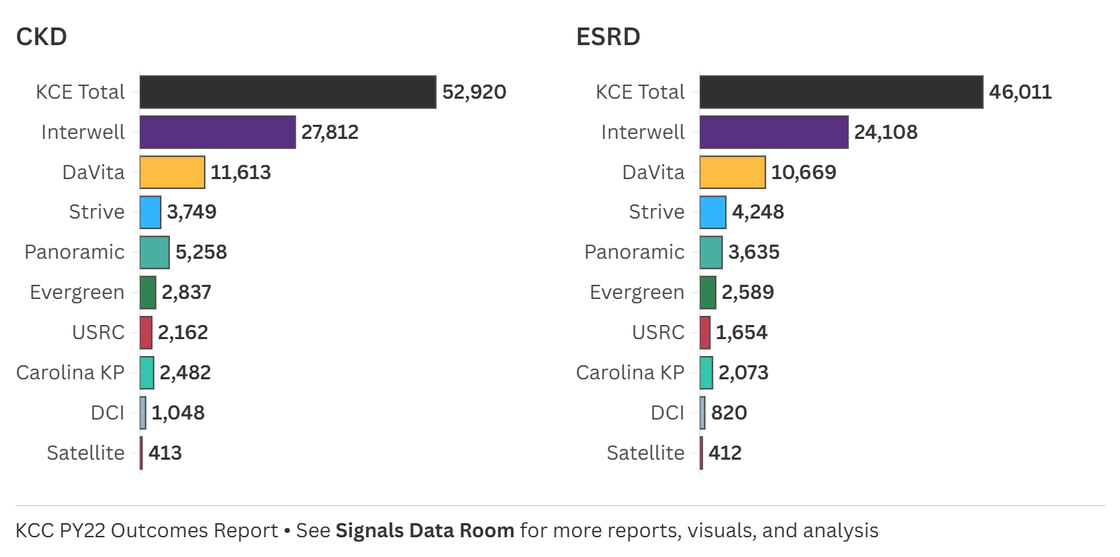
Should we see CMMI “rip the Band-Aid” on VBC as Secretary Azar recently suggested, these numbers will get much bigger. That will come with its own set of clinical, operational, and financial challenges, especially given the RTA hangover and the fact I’m not convinced these programs are (consistently, reliably) profitable? We’ll be keeping a close eye on upcoming annual results from both DaVita and Fresenius to get a better sense of VBC growth trends within IKC and Interwell, respectively.2
3. Spending Per Beneficiary: Comparing CKD / ESRD Costs
Looking at average CKD and ESRD spend per beneficiary, we see wide variation. The overall CKD spend per beneficiary across all KCEs was $25,029, but individual affiliates ranged from $20,200 (Carolina KP) to $24,946 (Panoramic), with Satellite spending the least at $21,599. Meanwhile, ESRD spending per beneficiary had even greater disparity. The KCE total was $77,348, but spending ranged from $66,236 (Carolina KP) to $92,391 (Satellite). These differences raise critical questions: What’s driving these variations? Are some groups more effective in managing CKD to prevent costly ESRD care, or are other structural factors at play?
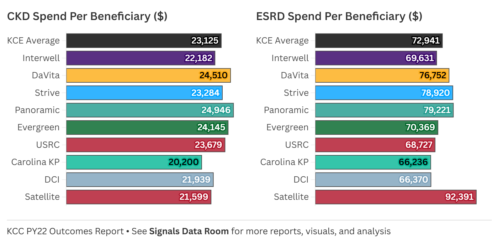
Spending differences are influenced by multiple factors, but one of the most important is patient risk scores. These scores reflect the acuity and expected cost of patient populations, meaning higher-risk patients typically require more intensive (and expensive) care. A KCE with a higher average risk score may naturally incur higher per-beneficiary costs, while lower-cost entities may be treating a relatively healthier population.3 With that in mind, here’s how spending and risk scores compare across entities at the individual level:
At the individual entity level, the variation is even more striking. Here are the highest and lowest spend levels by entity (states, affiliate, average risk score):
Lowest CKD spend: $17,807 (AL, Interwell, 2.09)
Highest CKD spend: $30,975 (CA/PA, DaVita, 2.54)
Lowest ESRD spend: $54,736 (AL/TN, DCI, 0.95)
Highest ESRD spend: $101,728 (CA, Panoramic, 1.02)
4. Total Expenditure: The Scale of KCC Spending
Total spending across all KCEs in PY22 exceeded $5 billion, with Interwell alone accounting for nearly half of that ($2.3B). DaVita followed with $1.1B in spending, while other affiliates operated at smaller financial scales. This data highlights the magnitude of investment in kidney care under the KCC model. It also prompts a closer look at how spending aligns with patient outcomes.
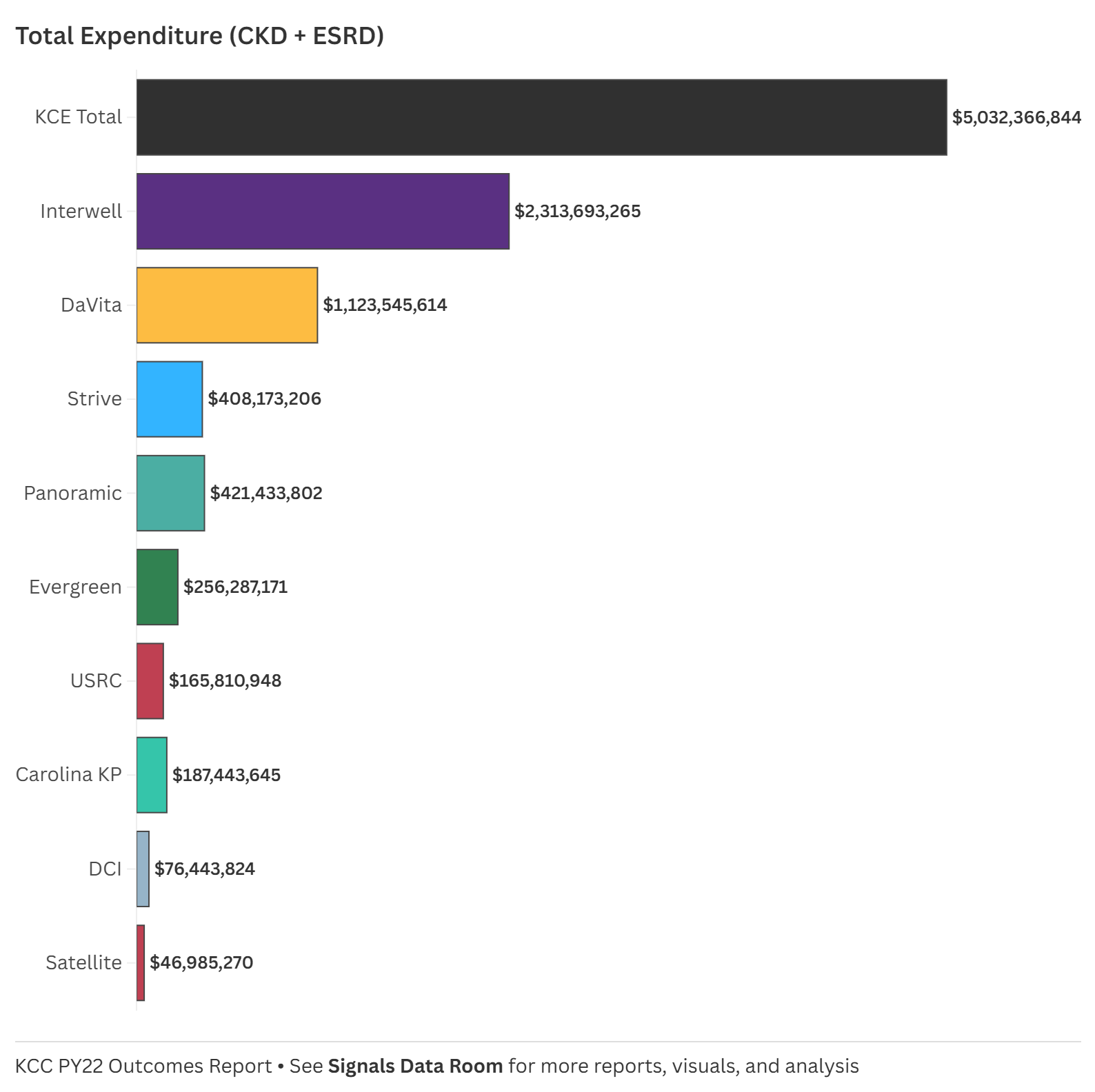
Interwell and DaVita accounted for two-thirds (68%) of total KCC spend in PY22, yet they had nearly three-quarters (74%) of beneficiaries. Does this point to fulfilling the promise of value-based care, or is this a function of operational efficiencies and the benefits of scale? Does this also bring us back to the ongoing conversation about giving patients access to the best available therapies and innovations for their individual needs, regardless of cost? Drugs, devices, services, you name it. The dialysis bundle is inherently limiting—is that on display here? And does the KCC model do enough to counteract those constraints? Perhaps the best way to answer these questions is by looking at dialysis setting and quality, which are core to how this model was designed.
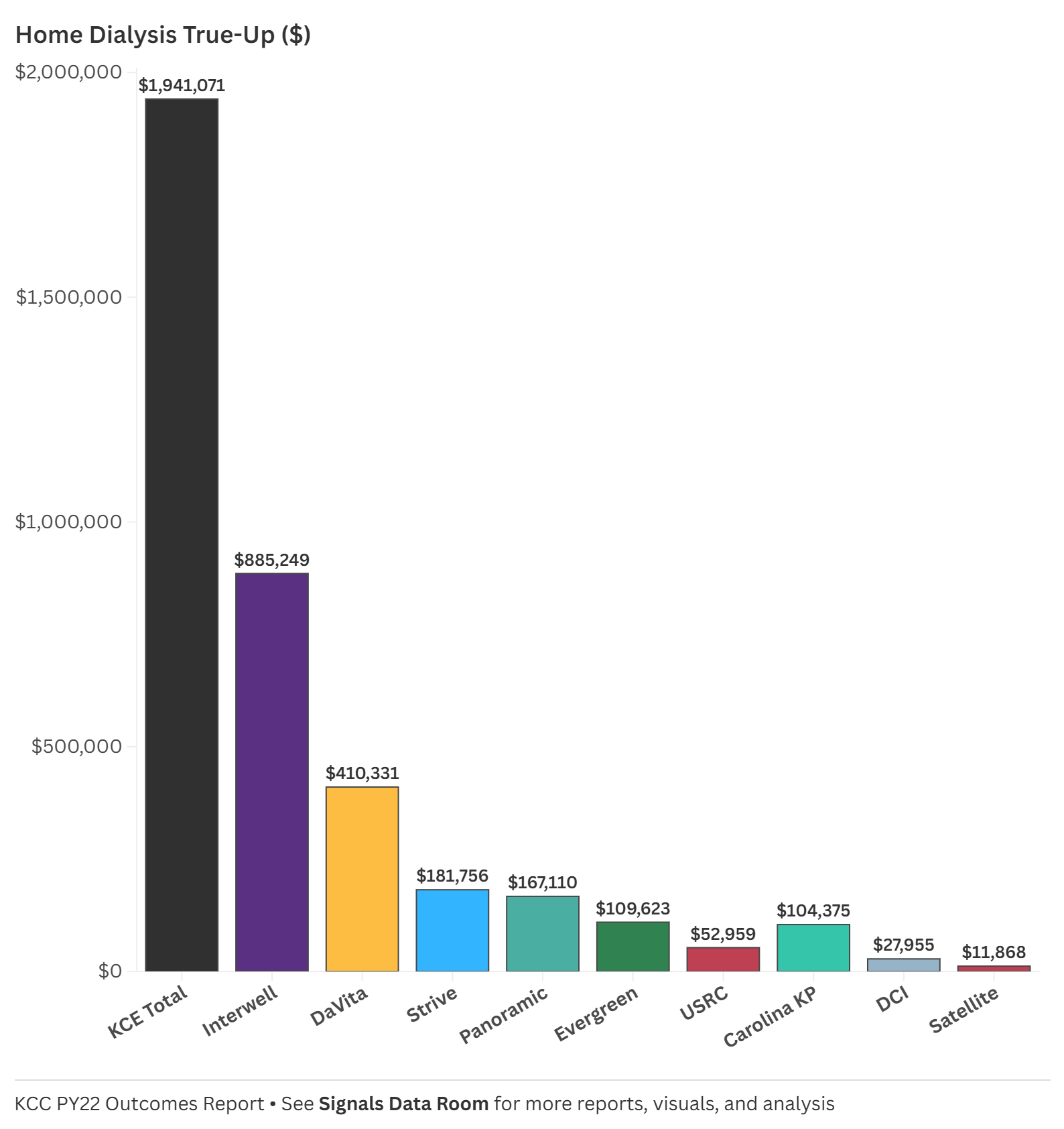
5. Home Dialysis True-Up: Truly A Carrot?
The Home Dialysis True-Up payments—designed to encourage home-based treatment—also varied widely among KCEs. I’d imagine this also differs greatly by modality, as we learned PD is doing the heavy lifting on home growth according to the latest USRDS annual report. The total amount distributed in PY22 was $1.94 million, with Interwell receiving nearly half ($885K), followed by DaVita ($410K). Some smaller affiliates received much lower payments, such as Satellite ($11K) and DCI ($27K).4
This raises a key question: Do these differences reflect actual gaps in home dialysis adoption, or do operational barriers, infrastructure challenges, and payment structures limit participation? Understanding how home dialysis adoption aligns with these payments will be critical in assessing the program’s impact.
6. Quality Scores: How Well Are KCEs Performing?
One of the most striking variations in the dataset is the average total quality score across KCEs. The overall average quality score was 80%, but the range was significant: Interwell scored the highest (87%), while USRC lagged behind (54%). Other notable scores included DaVita (72%), Evergreen (81%), and Carolina KP (75%). These numbers suggest that some KCEs are excelling in delivering high-quality care, while others may be struggling. But what drives these differences? Are higher scores linked to certain spending patterns or patient populations, or do operational practices play a bigger role?
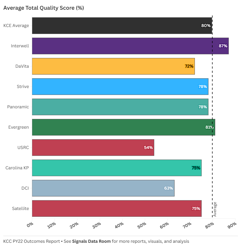
These differences raise broader questions about care delivery strategies: Are high-scoring KCEs simply spending more, or are they employing operational strategies that improve outcomes? And for lower-scoring KCEs, are there systemic challenges that make it harder to close the gap? As we move into PY23, tracking how these scores evolve will be critical.
Discussion
With the release of PY23 results on the horizon, this baseline serves as a launching point—not just to refine our analysis, but to help shape the conversation around KCC’s impact and evolution. As we continue tracking these trends, several key questions remain:
How do spending patterns shift over time? Are high-cost KCEs improving efficiency, or do early trends persist?
Does early CKD investment pay off? Do entities that spent more on CKD in PY22 see reduced ESRD costs in PY23?
What’s happening with home dialysis? Will adoption grow in year two, or do existing barriers remain?
How do quality scores evolve? Are low-performing KCEs making strides, or do systemic challenges persist?
The answers to these questions will help determine whether the KCC model is truly driving better outcomes—or if there are areas where adjustments are needed. What trends are you watching most closely?
Closing Thoughts
This PY22 Baseline serves as an evolving reference point, helping us track how the KCC model unfolds over time. As we look ahead to PY23 and beyond, I’d love to hear from those working in this space. What’s missing? What would make this analysis more useful? And don’t just take it from me— what other information from CMMI and other public datasets would be useful to have access to and include in these analyses?
Drop your thoughts in #vbc Slack or reach out directly—I’m happy to refine this and build a stronger benchmark that benefits us all.
Keep exploring,

PS — I turned this post into a single-page downloadable PDF in case it’s helpful. Feel free to open and download it from the data room below.
Fresenius owns about 75% of Interwell according to its latest annual report. The former owners of Cricket and Interwell own 17% and 8% of the newco, respectively (see pg. 228).
In case you missed it, we previewed some of the FY24 results with our latest Company Snapshots for both DaVita and Fresenius here.
“From 2012 to 2022, the percentage of incident ESRD patients using home dialysis grew by over 70%, from 8.5% to 14.5%. This growth, primarily driven by peritoneal dialysis (PD), slowed slightly during periods of PD solution shortages (mid-decade) and the COVID-19 pandemic. Several factors influence home dialysis adoption, including age, race, primary cause of ESRD, and neighborhood social deprivation index, or SDI.” Full post here.